-
Type:
Story
-
Status: Closed (View Workflow)
-
Resolution: Won't Develop
-
Affects Version/s: None
-
Fix Version/s: None
-
Component/s: None
-
Labels:None
-
Story Points:2
-
Work Type Classification:Sustaining
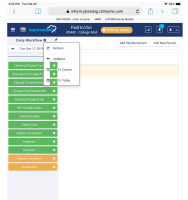
As a store user, I want the MxConnect Workflow on the iPad to appear the same as the Desktop browser applications
Notes
This story is to track UI issues that come up while using the MxC W/F on an iPad
Acceptance Criteria
- Validate the Pin Arrow does not interfere with the Task gear icon
(this might already be fixed)
- implements
-
CFAMX-6855 MxC - Cash Management Workflow
-
- Closed
-
1.
|
Review Test Scripts |
|
Ready for QA | Unassigned |
|
||||||
2.
|
Deploy |
|
Ready for QA | Unassigned |
|
||||||
3.
|
Functional Review with QA |
|
Ready for Developer | Unassigned |
|
||||||
4.
|
DIT |
|
Ready for Developer | Unassigned |
|

