-
Type:
Story
-
Status: Closed (View Workflow)
-
Resolution: Won't Develop
-
Affects Version/s: None
-
Fix Version/s: None
-
Component/s: None
-
Labels:None
-
SCRUM Team:Globogym Purple Cobras
-
Story Points:5
-
Work Type Classification:Paid Customization
CANCELLED
Story
In the process of creating or editing an order I would like to be able to hide the side menu buttons so that I can have more screen real estate for additional in-order columns.
Feature Details
New Elements
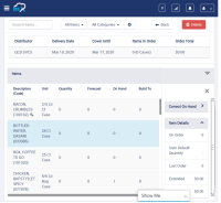
- A sliding side sheet menu container that houses all the action and info buttons in an order
- Suggested Details or Item Quantity Not Suggested
- Correct On Hand
- Item Details
- Previous Orders
- These elements should be dropped down to align with the line items in the order.
- A Doner Menu button on the right-hand side of the "Items" header.
- An "X" button in the new expanded menu.
Workflow
- The side menu defaults collapsed and the order header and line items expand to fill the space.
- The user clicks the Doner Menu icon and the menu slides out from the right side.
- The space required by the menu buttons should remain the same as the current space required.
- The user can interact with the buttons in the menu.
- This menu can scroll vertically if necessary
- The user can then close the side menu by either tapping/clicking the "X" icon or the Doner Menu icon.
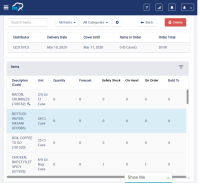
Portrait Resolution Example
Notes
- Currently, when the user switches to portrait mode, the order table shrinks and a column is hidden to account for the available real estate on the screen. This action should persist when the user opens the side panel. This should be true for any resolution that is too small to comfortably fit all the table columns and the side panel.
- Ideally, the side panel should slide open and closed over a period of time instead of instantly popping open and closed. This interval should be based on UX and feature feel.
Acceptance Criteria
Confirm
- The new UI elements listed above exist on the orders page.
- This is true for all orders states.
- The Donor menu icon opens and closed the side panel.
- The "X" icon closes an open side panel.
- The buttons and actions in the side panel work as they did before this feature was implemented.
- The default state of the panel is collapsed.
- implements
-
CFAMX-8157 Change Default Columns when Creating an Order
-
- Closed
-
1.
|
Review Test Scripts |
|
Done | Unassigned |
|
||||||
2.
|
Deploy |
|
Done | Unassigned |
|
||||||
3.
|
Functional Review with QA |
|
Done | Unassigned |
|
||||||
4.
|
DIT |
|
Done | Unassigned |
|


