-
Type:
Story
-
Status: Closed (View Workflow)
-
Resolution: Done
-
Affects Version/s: None
-
Fix Version/s: None
-
Component/s: None
-
Labels:None
-
Sprint:CFAMX 2020R4 SA Sprint 1, CFAMX 2020R4 SA Sprint 3, CFAMX 2020R4 SA Sprint 4
-
SCRUM Team:Globogym Purple Cobras
-
Story Points:3
-
SOW (Time Tracking) Project:45076
-
Work Type Classification:Sustaining
Story
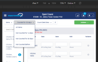
As a user, I would like the filter and sort options to be arranged in a different way. This will help me quickly access these options.
Button Order Update
Current
- Location/Item
- Last Counted Filter
- Travel Path
Desired
- Location/Item Sort
- Last counted "X" days filter
- Counted date sort
- Edit Travel Path (Including the existing icon)
UAC
Confirm
- The filter and sort options are ordered as follows
- Location/Item
- Last counted "X days filter
- Counted date sort
- "Edit Travel Path" button (including the existing icon)
- The buttons and dropdowns align when the resolution is iPad Portrait.
- The "Edit Travel Path" button label is dropped and the button only displays the icon when in iPad Portrait resolution.
- Other button labels are shortened as necessary to save space when in iPad Portrait resolution. Examples:
- "Items not counted for "X" Days" (and all labels of this type) shorten to "Not Counted "X" Days".
- "Sort by Travel Path" shortens to "Travel Path"
- "Last Count Date Descending" shortens to "Count Date Desc"
- "Last Count Date Ascending" shortens to "Count Date Asc"
- Shortening these labels is on an as-needed basis. If the buttons align without shortening the labels, then there is no need to shorten the labels. Please keep this in mind when developing and testing. The UAC items above are intended to provide suggestions for the language of the labels if there is a need.
- Clones
-
CFAMX-10657 Inventory Counts - User Defined Filter
- Closed
- implements
-
CFAMX-10224 INF-12211 Sort count by Last Count Time
-
- Closed
-
There are no Sub-Tasks for this issue.


