-
Type:
Story
-
Status: Open (View Workflow)
-
Resolution: Unresolved
-
Affects Version/s: None
-
Fix Version/s: None
-
Component/s: None
-
Labels:None
-
SCRUM Team:Brotherhood of Mutants
-
Work Type Classification:Sustaining
Story
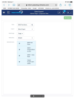
As an Admin, I want to see the space on the Data Export page, used effectively on a mobile device, so that I can best view the data on the page.
Acceptance Criteria
- Data displayed on the page is responsive to portrait or landscape views on the iPad
Example: The stores displayed in the table are wrapped in 2+ lines.
- implements
-
 CFAMX-12278
Functional Review with QA
- Done
1.
|
Review Test Scripts |
|
Ready for QA | Unassigned |
|
||||||
2.
|
Deploy |
|
Ready for QA | Unassigned |
|
||||||
3.
|
Functional Review with QA |
|
Ready for Developer | Unassigned |
|
||||||
4.
|
DIT |
|
Ready for Developer | Unassigned |
|

