-
Type:
Story
-
Status: Closed (View Workflow)
-
Resolution: Done
-
Affects Version/s: None
-
Fix Version/s: CFA 2022R1
-
Component/s: None
-
Labels:None
-
SCRUM Team:Great White
-
Story Points:1
-
Work Type Classification:Sustaining
Story
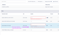
As a user, I would like the allocations warning message to order under "Quantity Not Suggested" text.
Details
Desired Location with Min/Max Example

AC
- When the allocations warning is visible on the screen, it orders below the "Quantity Not Suggested" message.
- When there is an allocation warning message, a Min/Max warning message, the the "Quantity Not Suggested" label all messages stack on inline with each other.
- Quantity Not Suggested
- Allocation warning message
- Min/Max warning message.
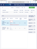
- The messages scale and locate correctly in desktop and tablet resolution.
- Clones
-
CFAMX-15131 UI Fix - Allocations Warning Message Location
- Closed
There are no Sub-Tasks for this issue.


