-
Type:
Story
-
Status: Closed (View Workflow)
-
Resolution: Done
-
Affects Version/s: None
-
Fix Version/s: None
-
Component/s: None
-
Labels:
-
Sprint:2022.R1 New Features Sprint 5
-
SCRUM Team:Brotherhood of Mutants
-
Story Points:5
-
Work Type Classification:Sustaining
Story
As a developer, I would like to create a reusable component for drop downs.
Description
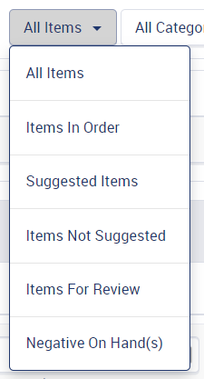
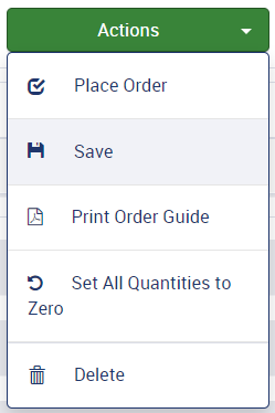
Lets create the dropdown component like the button component we have where we define some types. As starting types we can include default and actions for now.
the example pictures are provided below.
All the sub buttons shall be dynamically populated. The texts, icons, icon position, and also the click action should be provided from each usage.


Design
Styles That Apply to ALL BUTTON TYPES
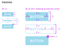
- 8px top and bottom vertical padding.
- 16px left and right horizontal padding.
- Minimum 8px spacing between text and icons.
- When necessary drop downs should include more space between the text and the caret when the button needs to be wider to accommodate the width of dropdown options. Text should be left justified against the padding and caret should be right justified against the padding.
- Carets are always RIGHT JUSTIFIED against the padding.
- Icons are always LEFT JUSTIFIED against the padding.
- 8px spacing between individual buttons.
- 1px border
- Corner Radius = 4px
- No outside shadows on DISABLED, ENABLED, IDLE.
- Small outside shadow on HOVER
- Small inside shadow on CLICK
- 12px Open Sans SimiBold font
- "Title Case" text
Styles Specific to Individual Button Types
Green buttons
- #91CC93 when DISABLED
- #5CB85C when ENABLED and IDLE
- #449D44 on HOVER or IN USE
- #5CB85C BORDER
- #FFFFF FONT
Filter - Sort - Page Redirect - Back - All other Line Buttons
- #CCCCCC Text and Border when DISABLED
- #FFFFFF background when DISABLED
- #4a5456 Text and Border when ENABLED and IDLE
- #FFFFFF Idle Background when ENABLED and IDLE
- #E6E6E6 Enabled Button Background on HOVER or CLICK
- #4A5456 Text color on HOVER
AC
Confirm that the default dropdown button has an example in the test page
Confirm that the actions dropdown button has an example in the test page
- implements
-
CFAMX-12484 InFORM Angular Technology Update
-
- In Development
-
1.
|
Create Test Scripts |
|
Done | Gareth Leibbrandt (Inactive) |
|
|||||||
2.
|
Create a base drop down component |
|
Done | Adrian Brink |
|
|||||||
3.
|
Create Types to be default |
|
Done | Adrian Brink |
|
|||||||
4.
|
Implement some examples on Test page |
|
Done | Adrian Brink |
|
|||||||
5.
|
Implement Dynamic Sub Buttons |
|
Done | Adrian Brink |
|
|||||||
6.
|
Design Review |
|
Done | Adrian Brink |
|
|||||||
7.
|
Deploy |
|
Done | Unassigned |
|
|||||||
8.
|
DIT |
|
Done | Adrian Brink |
|
|||||||
9.
|
Functional Review with QA |
|
Done | Adrian Brink |
|
|||||||
10.
|
Story Documentation |
|
Done | Adrian Brink |
|
|||||||
11.
|
Review Test Scripts |
|
Done | Unassigned |
|
|||||||
12.
|
Execute Test Cases |
|
Done | Gareth Leibbrandt (Inactive) |
|

