-
Type:
Story
-
Status: Closed (View Workflow)
-
Resolution: Done
-
Affects Version/s: None
-
Fix Version/s: CFA 2020R1
-
Component/s: CollectedSales
-
Labels:
-
Sprint:CFAMX 2020R2 Sprint 5, CFAMX 2020R2 Hardening
-
SCRUM Team:Brotherhood of Mutants
-
Story Points:1
-
Work Type Classification:Sustaining
As a developer, I would like to clean up any iPad issues around the Apply Payment UI
The following are a list of issues (aka AC):
Portrait Mode
- Unapplied Button should not wrap
- Description in the side panel should remain within the panel
- Applied Amount needs stretched out horizontally and Details panel vertically stretched out
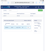
- Cannot see decimal value of Applied amount when the field is in the thousand of dollars amounts
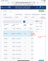
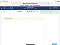
- Navigate to the collected sale history page and view the history in portrait mode and see that he headers are chopped off:
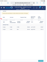
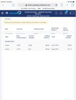
Landscape Mode
- Header missing when turning iPad (in Apply Payment screen and clicking the back button), from portrait to Landscape Mode
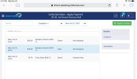
- Any other cosmetic issues due to the user using an iPad

- Scrolling on both Landscape and Portrait, specifically, I can't see the Red warning below the last cell when I exceed the Balance in the cell.
Ipad in general
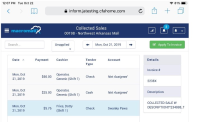
- After applying an invoice on Mar 3, 2020, the user is returned to the parent page, but the date (only in iOS) is updated to March 2 and not March 3rd! On Chrome the user is reverted to the correct parent page with date March 3rd. Today is March 3rd and the workflow has been completed up until March 3rd, so the iPad should navigate to March 3rd.
- implements
-
CFAMX-5958 CM - Collected Sales - MxC - Re-write & redesign the Collected Sales Page in MXC
-
- Closed
-
There are no Sub-Tasks for this issue.
