-
Type:
Story
-
Status: Closed (View Workflow)
-
Resolution: Won't Develop
-
Affects Version/s: None
-
Fix Version/s: None
-
Component/s: None
-
Labels:None
-
Sprint:CFAMX 2020R2 Sprint 5
-
SCRUM Team:Brotherhood of Mutants
-
Story Points:2
-
Work Type Classification:Sustaining
Story
As a developer I want to address the Ipad issues around the collected sales, split payment work
Acceptance Criteria
Portrait Mode
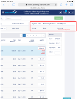
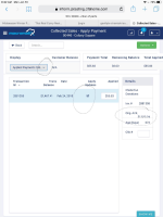
- The caret from the customer drop-down is displays like " (quotes) see screenshot
- The original Amount in the Details panel is cut-off in portrait mode
- # Warning messages go off the screen because of this panel off the screen in portrait mode:

- please determine if the area around the apply updates check box is wide enough for the typical user. Sometimes it checks and sometimes it doesn't, but I probably have fat fingers.

Landscape Mode
1 & 3 from above.
- is related to
-
CFAMX-7635 Collected Sales - Split Payment UI work
- Closed
-
CFAMX-5958 CM - Collected Sales - MxC - Re-write & redesign the Collected Sales Page in MXC
-
- Closed
-
1.
|
Review Test Scripts |
|
Done | Unassigned |
|
||||||
2.
|
Deploy |
|
Done | Unassigned |
|
||||||
3.
|
Functional Review with QA |
|
Done | Unassigned |
|
||||||
4.
|
DIT |
|
Done | Unassigned |
|

