-
Type:
Story
-
Status: Closed (View Workflow)
-
Resolution: Done
-
Affects Version/s: None
-
Fix Version/s: None
-
Component/s: SplashPage
-
Labels:
-
Sprint:CFAMX 2020R3 SA Sprint 4
-
SCRUM Team:Globogym Purple Cobras
-
Story Points:2
-
Work Type Classification:Sustaining
As a Product Owner I want the splash page to be updated to reduce the amount of white space around the messaging, so that it looks nicer
Notes
- Shrink the header bar
- Reduce the space <br> above and below the text
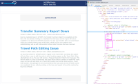
- Current

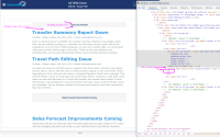
- New and improved:

- What I did, just with inspector, and I am open to ideas

- Removed 3 x <br> above and below content
- Reduced Padding to 5 in header
- Removed Margin on bottom of header
Acceptance Criteria
- Confirm that the default font for the Splash Page Editor is Verdada, and not Times New Roman
- Confirm that the size of the header is reduced to something sensible
- Confirm that there is not a large gap between the bottom of the header and the start of the text
- Confirm that there are not multiple extra blank rows inserted above and below the text
- implements
-
CFAMX-9678 Splash Page - Clean up/remove white space
-
- Closed
-
- is implemented by
-
CFAMX-9682 Augment/Create Load Tests
- Closed
-
CFAMX-9683 Documentation
- Closed
1.
|
Update styling |
|
Done | Colin Wyatt-Goodall |
|
|||||||
2.
|
Regression Test Cases |
|
Done | Gareth Leibbrandt (Inactive) |
|
